

The 3 Tests That Decide Whether a Refresh Destroys Your Brand (Part I)
Someone forward this to you? Subscribe to my BrandLab so you don't miss the next autopsy.

There's an element on every brand, on the front of the bottle or the top of the homepage or the sign above the door, that's doing more work than anyone who works on that brand realizes. It's the thing your customer uses to find you in under two seconds, without reading a word. Lose it in a refresh and you won't find out at a meeting. You'll find out when a buyer starts negotiating against you, when traffic slides without an obvious reason, or when a retailer quietly cuts your shelf space. By the time the dots get connected, too many other things have happened.
Tropicana refreshed their brand in 2009 for $35 million and lost $30 million in two months. They reversed the packaging in 47 days. Then, under new ownership in 2024, they did it again, and this time they refused to reverse. A $700 million brand forgot what it had paid to learn, because the people who paid to learn it no longer worked there. That is what corporate amnesia looks like.
Failed brand refreshes keep happening because a visual identity is briefed as a design problem when it’s actually a recognition problem. Designers are told to make it cleaner, more modern, more on-brand. Nobody tells them which elements the customer is already using to find the product, because nobody in the room knows. Identifying those elements is supposedly the job of a research firm that charges six figures and hands back a PowerPoint nobody reads.
What follows is the same method, without the PowerPoint. Three tests you can run before a refresh to find out which parts of your visual identity are load-bearing. Tropicana had every research firm on earth and still didn’t see it coming. You don’t need a research firm. You can do what they couldn’t with twenty strangers, a stopwatch, and a weekend, and it’ll cost you less than the lunch the agency would have charged to the project.
Here’s the decision tree. Save it, print it, pin it above the desk where refresh decisions get made. The rest of this piece explains why each branch matters. Tropicana is the case file.
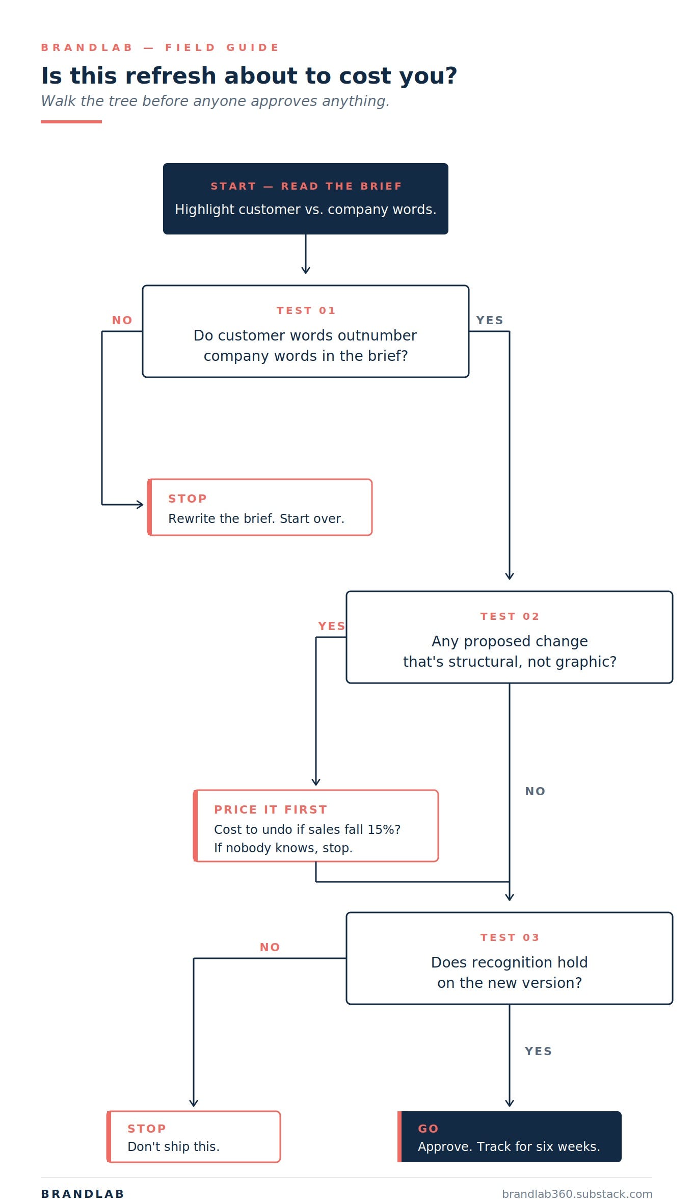
Test 1: The Recognition Test
Can a customer find you in two seconds?
Customers don’t read. They scan.
In a grocery aisle at normal walking pace, a shopper’s eye moves across roughly 11 products per second. On a website, a visitor’s cursor makes a yes-or-no decision in about 50 milliseconds. In either environment, text can’t register fast enough to do the work of recognition. What registers is a visual element distinctive enough that it doesn’t need a label underneath it.
In the marketing literature, those elements are called distinctive brand assets. Most strong visual identities have at least two of them working together. Tropicana’s flagship carton, for sixty years, had a pair: a horizontal Tropicana wordmark running across the front of the carton, and an orange with a straw sticking out of it. The wordmark told you the brand. The orange-with-straw told you the product. Neither was doing the job alone. Together, they were the shortcut customers were reaching for before their eyes had finished scanning the shelf.
In 2008, PepsiCo hired designer Peter Arnell to replace both. Arnell Group was paid $35 million for the redesign and launch campaign. He took the horizontal wordmark, rotated it ninety degrees, shrunk it, and pushed it to the side of the carton where it ran vertically like a label on a wine bottle. He took the orange-with-straw off the front entirely, moved it onto the cap as a squeeze gesture, and replaced it with a plain glass of juice on the main panel.
Sales fell 20% in two months. Tropicana lost roughly $30 million in revenue. The emails reaching the customer service line read, over and over: “I can’t find my Tropicana.”
47 days after launch, Tropicana reverted to the original packaging. Neil Campbell, then president of Tropicana North America, said the sentence every brand leader should have framed on their wall:
“We underestimated the deep emotional bond they had with the original packaging.”
The orange-with-straw and the horizontal wordmark were not decoration. They were navigation.
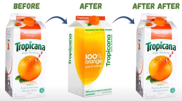
[ Side-by-side of the 1998-2008 Tropicana Pure Premium carton next to the January 2009 Arnell redesign.]
So how do you know if your visual identity is doing the job?
You don’t need a research budget. You need your current design, twenty strangers, and the willingness to watch what happens.
If you’re live today and want to know where you stand. Put your current visual identity in front of twenty people outside your team, for two seconds each, and ask what brand it is. A physical product gets printed at actual size and shown on a shelf. A digital brand gets shown as a homepage screenshot or a product detail page. A service or physical location gets shown as the storefront, signage, or whatever your customer actually sees when they arrive. If most of them name you correctly, you have something worth protecting, and the next time someone pitches you a refresh, you’ll know what’s at stake. If most of them hesitate or guess wrong, you’re already bleeding recognition and nobody on your team has told you, which is a harder conversation to walk into, but at least you’ll walk in with data instead of a feeling.
If there’s a redesign on the table right now. Run the test twice, back to back. Show twenty people your current version first and ask what brand it is. Keep only the answers from the people who got it right, because they’re the ones whose repeat business you live and die on. Then show those same people the proposed redesign and ask whether it’s the same brand. If the yes-rate drops, you now have the one piece of evidence the designer in the room doesn’t have, and you have it before the comps get polished enough that nobody wants to be the person who killed them. This is the test Tropicana didn’t run in 2008. You have three days and a printer.
If you haven’t launched yet. Put your proposed design next to four direct competitors from the same space, at the same scale, and show the line-up to twenty people for two seconds. Ask which one their eye landed on first and what they remember about it. If you’re trying to stand apart from the category, you want to be the first answer most of the time, with their memory landing on one specific element of your design, because that element is the asset you’ll defend for the next ten years. If you’re building to sit next to the category leader instead, the question flips: do they remember your name correctly, or do they confuse you with the incumbent?
Campbell’s apology was about one thing. Nobody at Tropicana knew which elements customers were using to find the juice until the customers stopped finding it. That’s the test the company skipped. The next one is why the test got skipped.
Test 2: The Brief Language Test
Is the refresh about your customer, or your P&L?
Every disaster starts with a brief. The brief that destroyed Tropicana in 2009 exists on the record, in Peter Arnell’s own words, at the launch press conference he gave the morning the new carton hit shelves.
Here’s what he said:
“We thought it would be very, very important to take this brand and bring it or evolve it into a more current or modern state.”
“Historically we always showed the outside of the orange. We had never shown the product called the juice.”
Not a single customer appears in either sentence. The brief Arnell was executing, and the brief he was describing at launch, was about PepsiCo’s appetite for looking modern, not about what the person buying orange juice at 8 a.m. on a Tuesday was going to experience. The customer doesn’t enter the company’s language until Campbell’s apology forty-seven days later, when “deep emotional bond” finally shows up.
A $35 million brief without a single customer in it. That’s not a failed design exercise. That’s a document that was never going to produce the right answer, because the right answer wasn’t what anyone in the room was looking for.
So how do you read the brief sitting already on your desk?
Somewhere in your inbox, or about to land there, is a brief telling someone what to do to your visual identity. The author doesn’t matter. The language does.
Pull the brief up and read it once. Highlight every sentence that describes something your customer will experience, like recognition, trust, reassurance, desire, whether they can find you, whether they want you when they do. Use a different color for every sentence that describes something the company will experience, like efficiency, sustainability, streamlined, modern, affordable, less plastic, on-trend.
If the customer color dominates, the brief has a real consumer thesis behind it, and the work that follows has a chance. If the company color dominates, the brief is an internal wishlist dressed up as a design project, and whatever comes out of it will be designed for the company, not for the person looking for you. Request a rewrite before any comps get produced. Once comps exist in a room, defending the existing design becomes the harder political position to hold, and the brief that should have been fixed gets ratified by default.
If no brief exists yet and you’re the one writing it, the same rule applies in reverse. Write one paragraph describing the outcome you want, not the design. Hand it to someone outside the business and ask whether it describes something your customer will experience or something the company will experience. If the answer is the company, rewrite it before sending it to a designer.
And if you’re the one defending against someone else’s brief, the question to ask in the meeting, out loud, before anyone touches a design: “What does a customer who already buys from us lose if we do this?” If nobody has an answer, the brief isn’t ready.
In 2009, Tropicana failed Test 1 because they wrote and executed a brief that failed Test 2. When they reversed the packaging, the reversal cost them printing plates and a full-page apology ad. Cheap. Fixable. Over in 47 days. The next time it happened, the math was different.
Test 3: The Graphic vs. Structural Audit
So how do you tell graphic from structural?
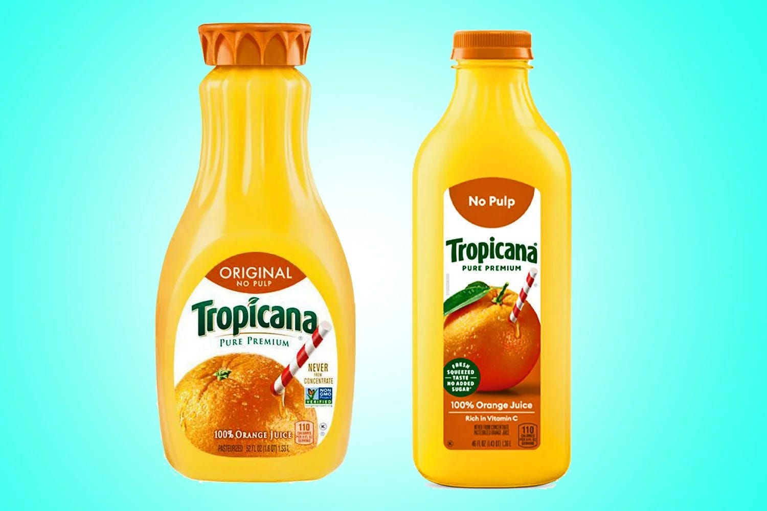
[Two Tropicana bottles, side by side. Left: the 52oz sculpted Pure Premium carafe from pre-2024.Right: the 46oz replacement bottle from July 2024.]
In August 2021, PepsiCo sold 61% of its juice business, including Tropicana, to PAI Partners for about $3.3 billion. A new entity formed: Tropicana Brands Group. New leadership, new incentives, and the mandate common to every PE acquisition of a legacy brand, which is margin expansion.
Three years later, Tropicana Brands Group replaced the 52oz sculpted Pure Premium carafe Fuseneo had designed in 2011. The crown-capped silhouette customers had been reaching for since Obama’s first term became a 46oz slimmer bottle with a generic stock cap. No campaign. No announcement. The smaller bottle just showed up on shelves in July 2024.
Sales fell 8.3% in July, 10.9% in August, 19% in October. Four points of market share moved to Simply Orange, whose bottle looked like it always had. Brent Lindberg, the Fuseneo founder who designed the original carafe, said the quiet part out loud in Packaging World:
“In my opinion, this was a miscalculation. With their majority sale to private equity in 2021, they likely needed to see better margins. I think the numbers drove the decision more than the consumer.”
Tropicana Brands Group did not reverse. Their official statement: “recent third-party data shows that unit sales are returning to normal.” No numbers. No source. No date. Just a sentence designed to keep the lights on while the tooling sits in the factory.
The reason they couldn’t reverse is the whole point of Test 3.
In 2009, Tropicana had made a mistake on the printed front of a carton. Graphic. When sales fell, PepsiCo threw out the printing plates and went back to the original design in 47 days. The cost of reversing was low enough that the decision was easy.
In 2024, Tropicana Brands Group made a different kind of mistake. The bottle itself changed. That’s a new mold, a new fill-line calibration, new retailer planograms, new case dimensions, new pallet math. The cost of reversing a structural change can run ten to fifty times the cost of making it. That’s not a decision a PE-majority-owned company reverses because some consumers complain. That’s a decision that gets defended until the numbers show something else, or until the numbers are quietly redefined.
The test, for your own visual identity
Every element of your brand’s visual identity is either graphic or structural.
Graphic is reversible: logo, color, label copy, icon, wordmark, front-of-pack layout, website type system, homepage hero, storefront window vinyl. Anything printed, digital, or applied can be changed again in weeks.
Structural is committed: bottle silhouette, cap shape, fill volume, material, a physical store’s layout or fixtures, a website’s core information architecture, a product’s industrial design. Anything molded, engineered, or built into the fabric of the thing takes months or years to undo, and costs many multiples of what it cost to commit to in the first place.
Graphic is a conversation with your customer. Structural is a vow.
Before any refresh gets approved, split the proposed changes into two columns. If every proposed change is graphic, your cost of being wrong is survivable, and you can proceed with Test 1 and standard caution. If any change is structural, the reversal cost needs to sit on the same slide as the projected savings before anyone approves anything.
The question to ask in the room, out loud: “If we do this and revenue falls 15%, what does it cost us to undo it?” If nobody knows the number, the decision isn’t ready.
Break the graphic vow, and you apologize. Break the structural one, and you spend the next five years telling the press that unit sales are returning to normal.
Coming next on BrandLab: what happens when the refresh has already launched and the numbers are telling you something nobody on your team wants to hear. How to catch a mistake in the first weeks instead of the first months.
Subscribe so you don’t miss it.
Know a brand that deserves an autopsy? Reply to this email.
Your comments are all spot-on/could not say it any better if I tried. YES-retailers like Loblaws, in Canada, took initiative away from overly- confident manufacturers with perfect in-house control of ALL of The Shelf, Distribution, Trade Marketing and (my favorite) Romancing The Consumer-in the creation of premium private label . Where am I seeing this most ?: brands that never built the discipline, or established ones that got lazy after they had distribution? BOTH are equally TRUE- but the 1st one more so. SOME took their national brand status as a long term given aka-they never presumed that "private label brands" were brands & have increasingly become important Brands- ! ( it also doesn't hurt when you can offer consumers equivalent quality at lower price ..or superior quality at the same price-at eye level, in a PL program )
Excellent summary and case study! I STILL am amazed how many marketers do not prep detailed Design Briefs...and....how many CPF Food & Bev products have sub-par pkg. design-to the point that premium private label or even generic private label have better/more appetite appeal design. Some do not see optimized package design as an enhanced, forward moving marketing and sales tool-but as a cost!